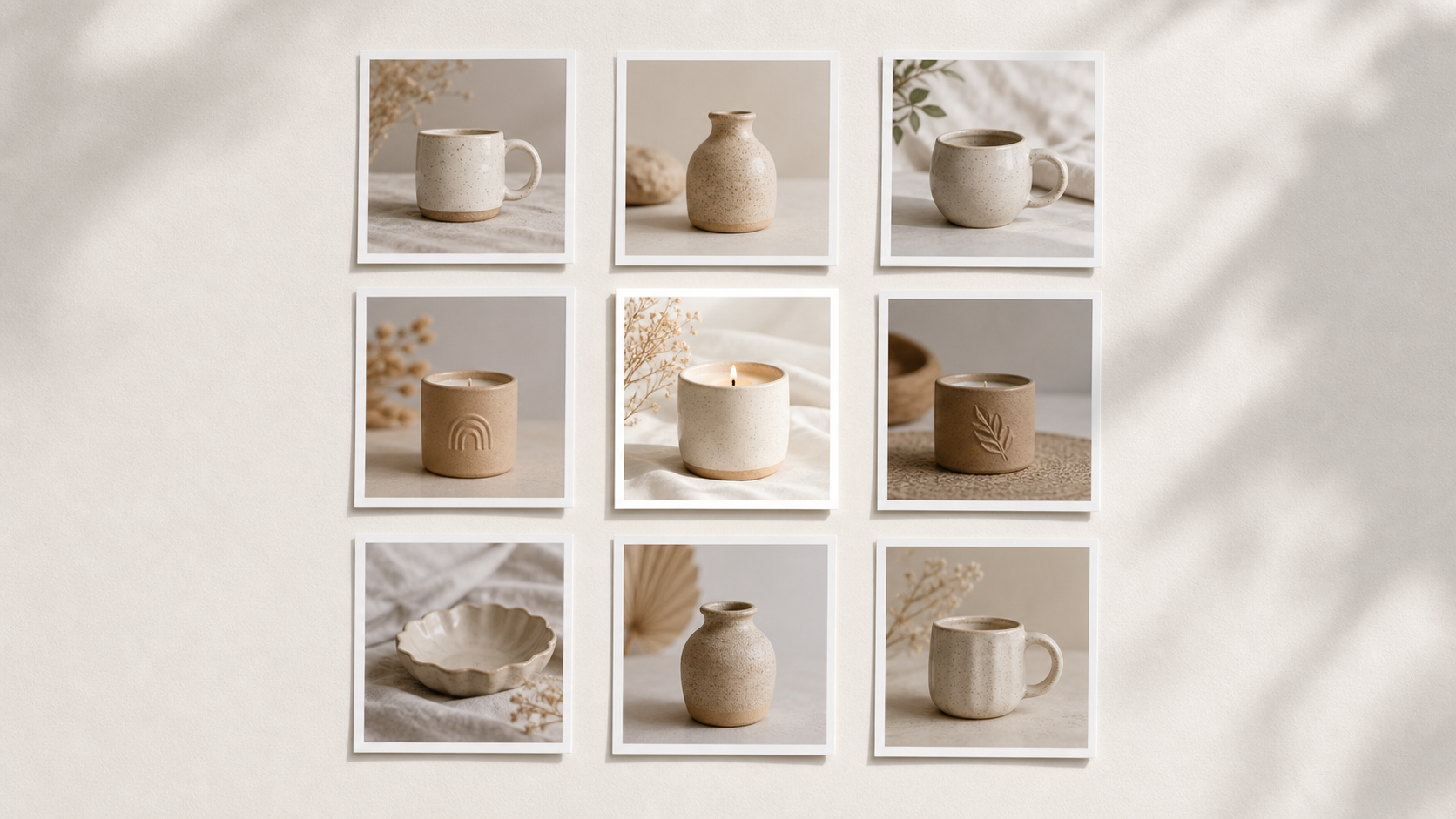
Etsy's search results show roughly 64 listings per page in a tight grid. Each listing gets a thumbnail roughly 220 pixels wide on desktop and even smaller on mobile. That's the entire battlefield. The listing with the clearest, most trustworthy thumbnail wins the click — not always the one with the most beautiful styling, the lowest price, or even the best reviews.
This guide breaks down what specifically earns clicks in that grid: how main images are read, what supporting images do for conversion, and how to test your photos against the listings actually ranking around you.
The main image has exactly one job
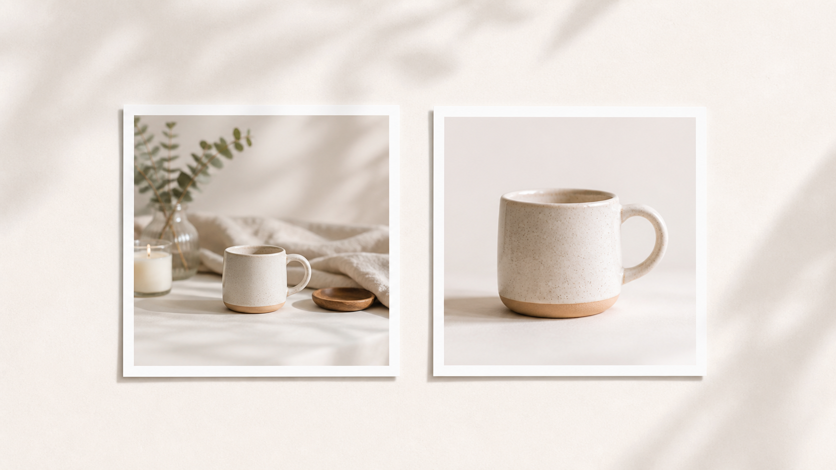
Win the click. That's it. Everything else — variation, packaging, lifestyle context, scale — happens in supporting images. The main image just has to make a stranger instantly understand the product at 220 pixels wide. The "Instantly Clear" thumbnail above is the model: tight crop, simple background, one obvious subject.
A main image that works in Etsy search usually has a tight crop where the product fills 60 to 80% of the frame. No more, no less. A simple background — white, cream, light wood, or soft texture. Not a styled flat lay. Bright, even light with no deep shadows hiding detail and no blown-out highlights. A square 1:1 ratio, because Etsy crops to square in many places. And one clear subject — if you sell a candle, show the candle, not the candle plus a book, a coffee mug, dried flowers, and a sweater.
The instinct to add styling is strong because styled photos look better on a large monitor. But Etsy shoppers see your photo at thumbnail size first, and styling becomes visual noise at that scale. Save the styling for image 2.
The thumbnail test
Open your main listing image and shrink it on your screen until it's about 1 inch (220 pixels) wide. Then ask: can a stranger identify the product type in one second? Is the color obvious? Are the most important details — sticker design, jewelry shape, candle style — visible? Does it look like a real photo, or does it look like a busy collage?
If any answer is no, the image is doing too much. Crop closer. Simplify the background. Brighten the light. Try again.
Buyer questions are the real ranking signal for clicks
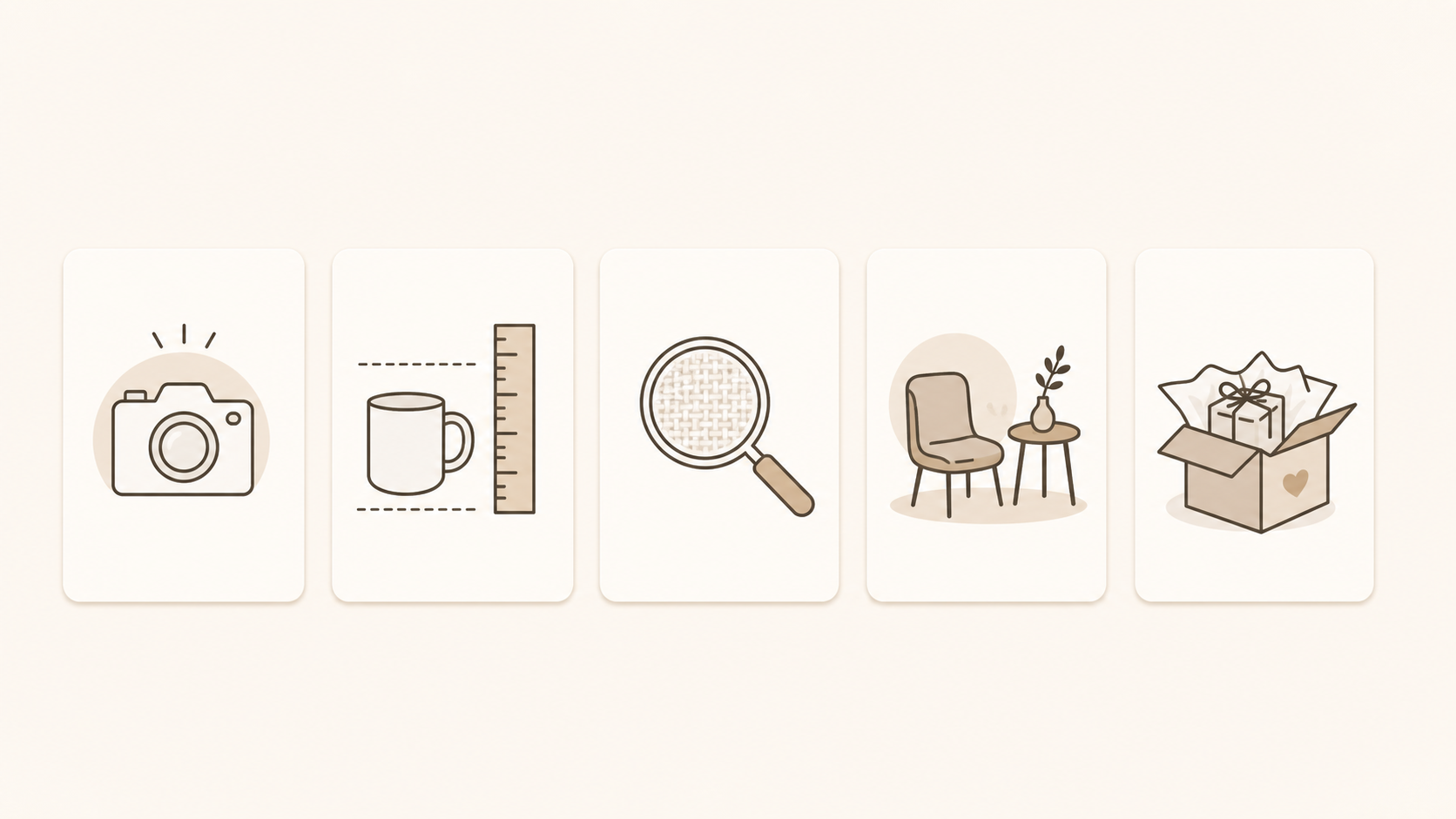
Every product category has a different click question. Candles: what does it look like and what's the vessel? Show the whole candle with the vessel visible on a clean background. Jewelry: what's the design and how does it look on? Show a close-up of the piece with a clear shape, or a worn detail shot. Stickers: what's the design? Show the sticker face-on with the design readable on a clean background. Art prints: what's the artwork? Show the print itself, framed or unframed, with no clutter. Soap: what does it look like and what scent family? Show the bar with one color cue. Knit goods: what's the texture and color? Digital downloads: what's the design and does it look polished? Show the file in realistic use — printed, framed, on screen.
Your main image should answer the click question. Everything else in the image set answers later questions (the infographic above is a fast reference for which job each image is doing).
Useful contrast beats loud contrast
Standing out in search doesn't mean adding neon backgrounds or arrows or text overlays. It means looking different in a way that builds trust, not different in a way that screams.
Open Etsy in a private browsing window and search the exact keyword you're trying to rank for. Screenshot the first page. Now drop your main image into that grid mentally and ask: does my image look brighter than the average competitor? Is my product cropped closer? Is my background cleaner? Does my photo feel more professional?
If two or three of those are yes, you're winning the click. If most are no, the image needs work — not a redesign of the product.
Supporting images close the sale
The main image gets the click. The supporting images close the sale. Buyers who click through scroll the rest of the gallery before deciding to add to cart. A strong set covers: image 2, close-up detail and quality proof; image 3, lifestyle scene showing use; image 4, scale shot; image 5, packaging or what arrives; image 6, variations like colors, sizes, or sets; image 7, personalization or detail callout if applicable; images 8 through 10, additional angles or context as needed.
Each supporting image should reduce a specific hesitation. If buyers are unsure about size, the scale shot answers it. If they wonder about packaging, the packaging photo answers it.
How to test thumbnails with Stageflow
You don't have to commit to one main image guess. Stageflow lets you generate multiple thumbnail directions from the same product photo, then test them in context before publishing.
Practical workflow: upload your product photo to Stageflow. Generate three main-image variations using three different prompts. Studio: "Clean Etsy main listing photo of [product] on a pure white background, soft natural shadow, bright daylight, generous margin." Cream: "[Product] on warm cream paper, soft side light, minimal styling, square crop." Lifestyle minimal: "[Product] on a clean light wood surface, soft window light, no props, straight-on angle." Use the Environment buttons to switch between Studio Setting and Lifestyle Setting between generations. Drop each thumbnail into the Etsy search screenshot exercise above. Pick the one that stands out as cleaner — not louder. Publish your winner. Save the prompt structure for future listings.
If your existing listings aren't converting, this is the fastest test you can run. Generate three new thumbnail options. Compare them against the live search grid for your keyword. Swap in the strongest one.
Common click-killers
Avoid these in main images: text overlays — Etsy hides parts of the image in search anyway, and text usually gets cropped. Bundle collages — "5 designs for $10" collages look cluttered at thumbnail size. Aggressive borders or frames that eat the limited canvas. Mirror-stamp logos or watermarks that scream "stock image." Three-quarter angle shots when straight-on would be clearer — don't use a fancy angle if a flat angle reads better. Heavy filters or graded color — buyers want accurate color, not aesthetic mood.
Bottom line
Etsy search clicks come from clarity, not from creativity. The main image has one job — make the product instantly readable in a tiny thumbnail next to 11 competitors. Strip everything that doesn't help that job. Use supporting images for everything else. Test with Stageflow, compare in context, and choose the image that looks cleanest in the grid.
For a complete listing image strategy, pair this with The Ultimate Guide to Etsy Product Photography (2026). For scene ideas, browse 25 Etsy Product Photography Examples You Can Recreate With AI.