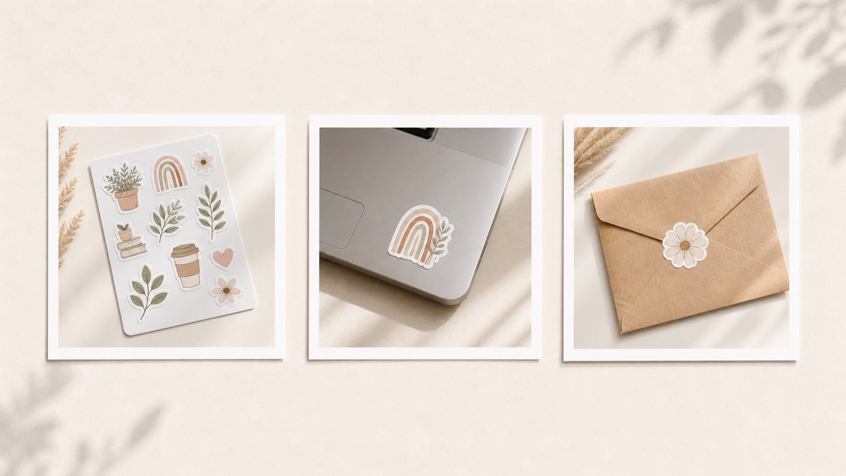
Sticker listings live or die on the thumbnail. A buyer can't touch the vinyl, see the finish in person, or hold the sticker up to their laptop. Your mockups have to answer all of that in the time it takes to scroll past your listing. The good news: sticker mockups don't have to be complicated. They have to be clear, realistic, and consistent.
This guide covers the practical workflow — what each image in a sticker listing should do, what to avoid, and how to generate the whole set in Stageflow with copy-paste prompts.
The five images a sticker listing actually needs
Most sticker sellers either over-stuff their listing with similar shots or under-deliver with two photos. The sweet spot is five images, each doing a different job: clean main image to win the click in search, scale shot to answer "how big is it?", lifestyle use shot to show where the sticker goes, finish close-up to show matte, glossy, or holographic detail, and packaging shot showing what arrives in the mail.
You don't need ten variations. You need five that each reduce a buyer hesitation.
The main image: make the design readable
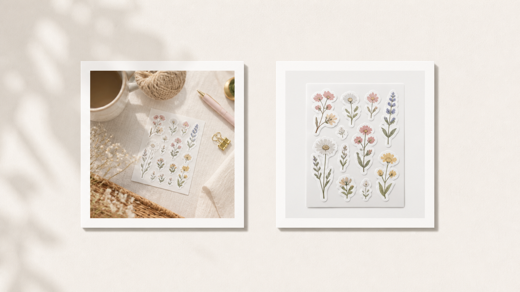
The most common sticker mockup mistake is making the scene more important than the sticker. A beautiful desk with notebooks, plants, coffee, and tape looks nice on a large screen and disappears at thumbnail size. For the main image, the rule is simple: if a stranger can't read your sticker design at thumbnail size, the image is doing too much. The "Clean and Clear" example above is the target.
For each sticker type, the main image should be different. Die-cut sticker: the sticker face-on against a clean background, visible die-cut edge, subtle natural shadow. Sticker sheet: the full sheet shot straight-on with all designs clearly readable, generous margin around the edges. Sticker pack: the set fanned slightly or laid out in a grid with every design readable.
Save the lifestyle styling for image 3. The main image earns the click.
Different sticker types, different main shots
Die-cut single sticker prompt: "Clean Etsy main image of a die-cut vinyl sticker of [design] on a warm cream background, soft natural shadow showing the die-cut edge, soft daylight, generous margin around the sticker, square crop."
Sticker sheet prompt: "Flat lay of a sticker sheet with [design] designs on an off-white background, photographed straight-on from above, even lighting, no harsh shadows, all designs clearly readable, minimal styling."
Sticker pack prompt: "Clean product photo of a sticker pack with [number] stickers fanned out slightly on a neutral surface, soft daylight, all designs visible, square crop."
Scale shots — the most useful supporting image
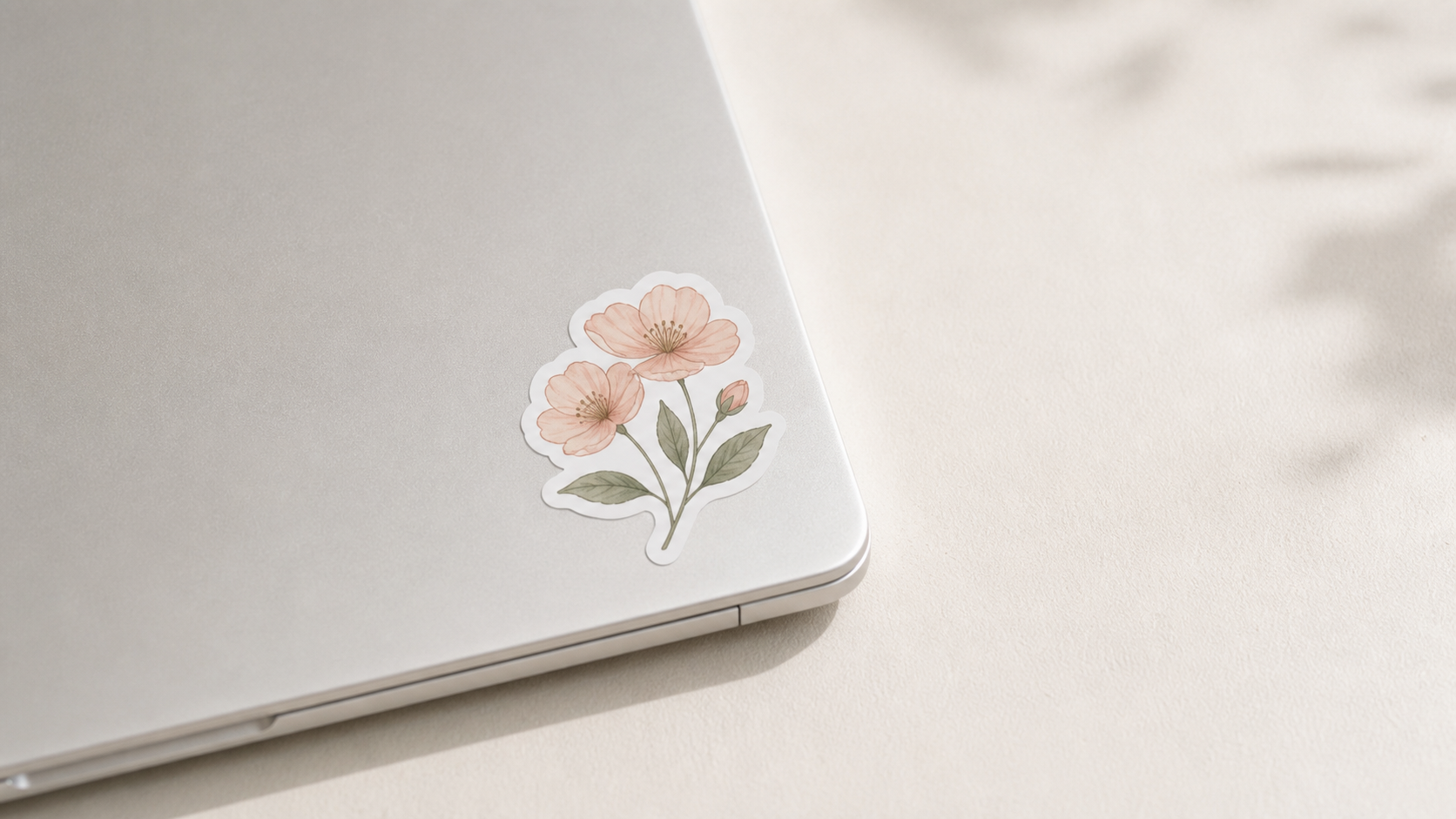
Sticker sizes are hard to imagine from a number. A "3-inch sticker" sounds clear until the buyer wonders if that's the height, the width, the diagonal, or the printed area. A scale shot answers it instantly.
The key to scale shots is realism. AI mockups often fail here — a sticker appears too large like in the "Unrealistic Scale" example above, or warps unnaturally around a curved surface, or floats with no shadow. Be specific in your prompt.
Laptop scale prompt: "Place [my sticker design] on the lower right corner of a clean silver MacBook laptop lid, realistic 3-inch scale, soft daylight, no other props, minimal background, slight natural shadow under the sticker edge."
Water bottle scale prompt: "Apply [my sticker design] to a matte white stainless steel water bottle, realistic small scale, soft daylight, clean kitchen counter background, slight curve to the sticker matching the bottle surface."
Notebook prompt: "[My sticker design] applied to the cover of a kraft brown notebook, realistic scale roughly 2.5 inches wide, soft daylight, clean wood desk, single pencil partially visible."
Phone prompt: "[My sticker design] on the back of a clear phone case held against a clean neutral wall, realistic small scale, soft daylight, focus on the sticker."
Specifying scale in the prompt — "realistic 3-inch scale" — matters. Without it, AI defaults to wildly different sticker sizes between generations.
Finish close-ups — only when finish matters
If your sticker is matte, glossy, holographic, transparent, or textured, a close-up helps. If it's standard vinyl, a close-up wastes a slot.
Matte finish prompt: "Close-up of [my sticker design] showing matte vinyl finish, no shine or reflection, soft directional light, clean background, focus on the surface texture."
Glossy finish prompt: "Close-up of [my sticker design] showing glossy vinyl finish, subtle light reflection on the surface, soft side light, clean neutral background."
Holographic finish prompt: "Close-up of [my sticker design] showing holographic finish, rainbow shimmer visible at a slight angle, soft directional light, clean white background."
Transparent sticker prompt: "[My sticker design] on a clean wooden surface where the transparent border is visible against the wood grain, soft daylight, focus on the clear edge."
For transparent stickers especially, choose a surface with visible texture so the transparency reads in the image.
Lifestyle shots — pick the right surface
Lifestyle shots help the buyer imagine using the sticker. The trick is choosing surfaces that match the sticker's audience. Cute animal or floral designs: water bottle, journal, planner, phone case. Motivational quotes: laptop, water bottle, gym bag. Hobby or niche designs: the specific object — gaming controller, camera body, instrument case. Kid stickers: clean light surfaces, no adult props. Plant lover stickers: alongside a small plant or pot.
Match the surface to the buyer, not the other way around.
Repeatable system — the same five scenes for every sticker
One good mockup is helpful. A repeatable system is better. Most Etsy sticker sellers have dozens of designs. You don't have time to invent a new mockup for every one.
Pick five scenes and use them for every sticker. Clean main shot — same background, same crop, same light across the shop. Laptop scale — same laptop, same corner, same lighting. Water bottle lifestyle — same bottle, same scene. Finish close-up — same angle, adjusted only for finish type. Kraft mailer packaging — same mailer, same lay-down.
Save these prompts. Apply them in order for every new sticker design. Your shop will look cohesive without manual styling work.
How to do this in Stageflow
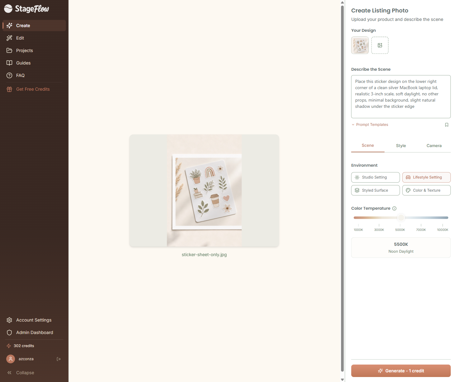
Open Stageflow and create or open a project for your sticker shop. Upload your sticker design (PNG with transparent or white background works best) into the Your Design slot you see in the screenshot above. Paste one of the prompts above into the Describe the Scene field. Pick the matching Environment button: Studio Setting for main shots and finish close-ups, Lifestyle Setting for laptop, water bottle, and notebook scenes, Styled Surface for flat lay packaging shots. Adjust the Color Temperature slider — 5500K (Noon Daylight) is the default; use 4500K for a warmer, cozier feel. Generate, compare a few outputs, and pick the one with realistic scale and natural shadow.
What to avoid
Stickers floating with no shadow. Stickers warped or distorted on curved surfaces. Unrealistic scale, like a 3-inch sticker the size of a notebook page. Stickers blended into the background with lost edges. Fake readable text or logos appearing nearby. The same template style every competitor uses. Five lifestyle shots and zero clean main image.
Bottom line
Good sticker mockups are clear, consistent, and believable. Pick five scenes, generate them for every new design, and save the prompts so your shop builds a recognizable style. For sizing details, see the Etsy Image Requirements Guide. For more scene ideas beyond stickers, read 25 Etsy Product Photography Examples You Can Recreate With AI.